SDGA Platforms Code → React 19
Saudi Arabia’s DGA design system, as React components.
A free, MIT-licensed UI component library for Saudi Arabia’s DGA Platforms Code: 65 accessible React 19 components. RTL-native, Arabic-first, dark-ready, WCAG 2.2 AA.
Independent project. Not affiliated with, nor endorsed by, the Saudi Digital Government Authority (DGA).
A government website registered with the Digital Government Authority.
Official Saudi Government websites URL ends with .gov.sa
Website belongs to an official government organization in the Kingdom of Saudi Arabia always ends with .gov.sa .
Official Reliable websites use HTTPS
Ensure the website is using the HTTPS protocol.
Registered on Digital Government Authority:
00000000000The proof
Three things a government team checks first.
Every claim here has a page behind it. Read them yourself.
About the library
One system, every government platform.
dev-dga turns Saudi Arabia’s DGA Platforms Code into a real, installable React library - so teams ship consistent, accessible, Arabic-first products without rebuilding the basics.
Faithful to the spec
Colors, typography, spacing and components mirror the official DGA Platforms Code, measured value-for-value.
Arabic-first
Right-to-left and IBM Plex Sans Arabic are the default case, not a later patch.
Composable & typed
React 19, cva variants, asChild composition, and full TypeScript types on every prop.
MIT licensed
Independent and free to use under the MIT license. Not affiliated with the official DGA.
Installation
Install, wrap, ship.
Add the three packages, import the CSS once, and wrap your app in the provider. That’s the whole setup.
Install the packages
Import the styles once (e.g. in your root layout)
Wrap your app and start composing
Theming
One token, the whole system follows.
Swap the primary palette on the provider and every component re-tones - hover and active states are derived automatically with color-mix().
RTL & Arabic
Right-to-left is the default case.
Set dir="rtl" on the provider and the entire layout mirrors - using logical properties throughout. IBM Plex Sans Arabic covers Arabic and Latin from one family.
Renew vehicle registration
تجديد استمارة المركبة
Dark mode
Every surface reads correctly in dark.
Dark mode is built on the --ddga-* variables plus colors chosen per surface, not a mechanical inversion of light. The same component works in both modes with no divergence.
Renew vehicle registration
Renew vehicle registration
Accessibility
WCAG 2.2 AA, proven by tests.
Radix primitives for the hard widgets, real keyboard semantics tested in a browser, and axe assertions that fail the build.
Radix primitives
Menus, dialogs and tabs wrap battle-tested primitives for correct ARIA and focus management.
Real keyboard semantics
Roving tabindex, focus traps, arrow-key nav and Escape are verified in Playwright.
Tested with axe
Every component has vitest-axe assertions, so accessibility regressions fail the build.
Visible focus
A consistent focus ring on the ink color, honoring prefers-reduced-motion.
Architecture
Three packages, one direction of flow.
Tokens are the source of truth; the CSS package turns them into cascade-layered variables; the React package ships no CSS - only classes that resolve them.
Design tokens as typed TS objects - colors, type, spacing, radius, shadow. Also exports tailwind-preset: the same keys as a Tailwind v3 preset.
Generated --ddga-* custom properties, reset, dark theme, and per-component styles in @layer. Its tailwind.css bridges every token to Tailwind v4 utilities.
React 19 components (cva + cn) emitting ddga-* classes that resolve the CSS variables.
Demo examples
Real screens, built entirely from the library.
See the components composed into complete products - dashboards and services, in Arabic and English, light and dark.
Templates
Complete government pages, from the library alone.
Each template assembles every section of an official Platforms Code page from @dev-dga components: government banner, header, hero, about, services, news, partners, and footer. Arabic and English, light and dark, responsive.
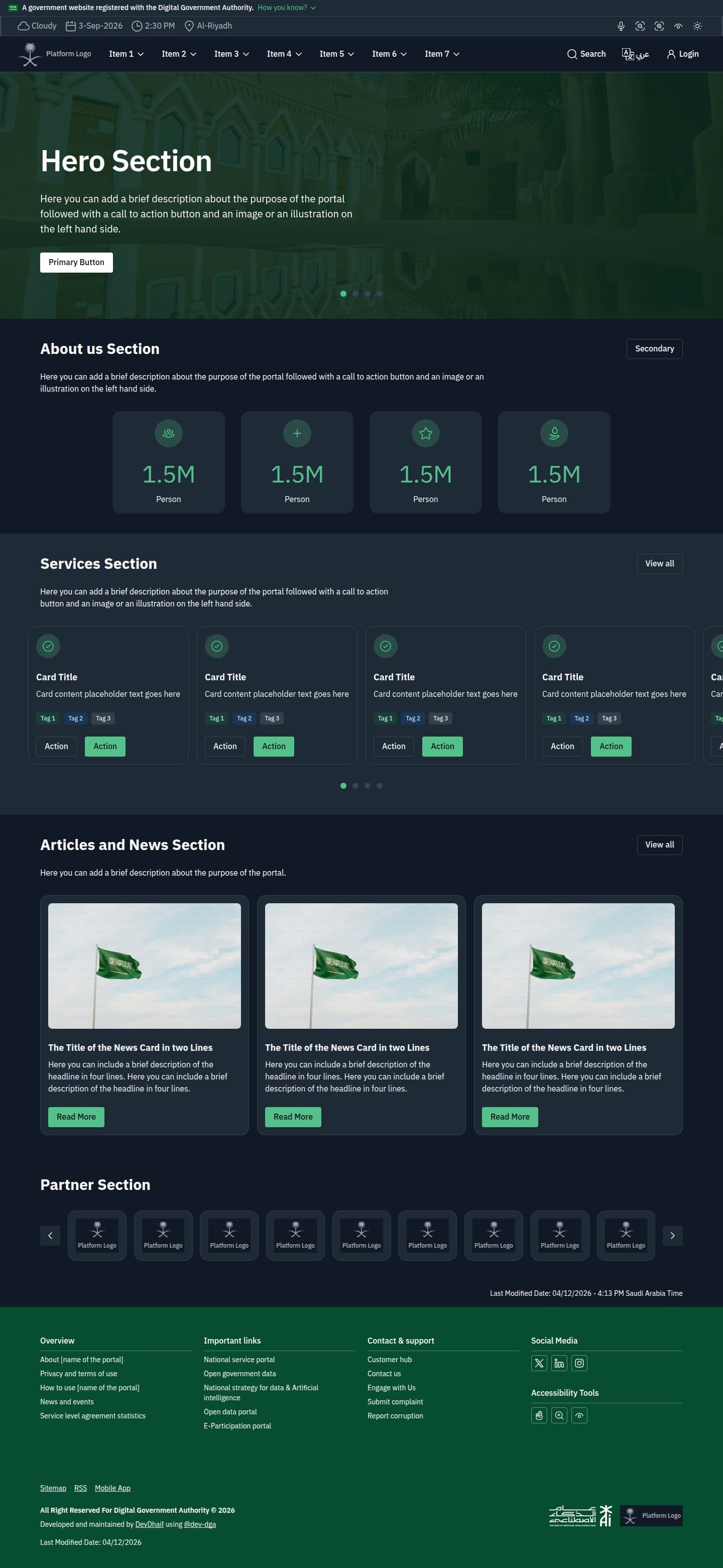

DGA home page template
Every section from the government banner to the footer, composed from @dev-dga with no custom components. Copy the structure, swap the content, and ship.
- @dev-dga only
- Arabic and English
- Light and dark
- Responsive
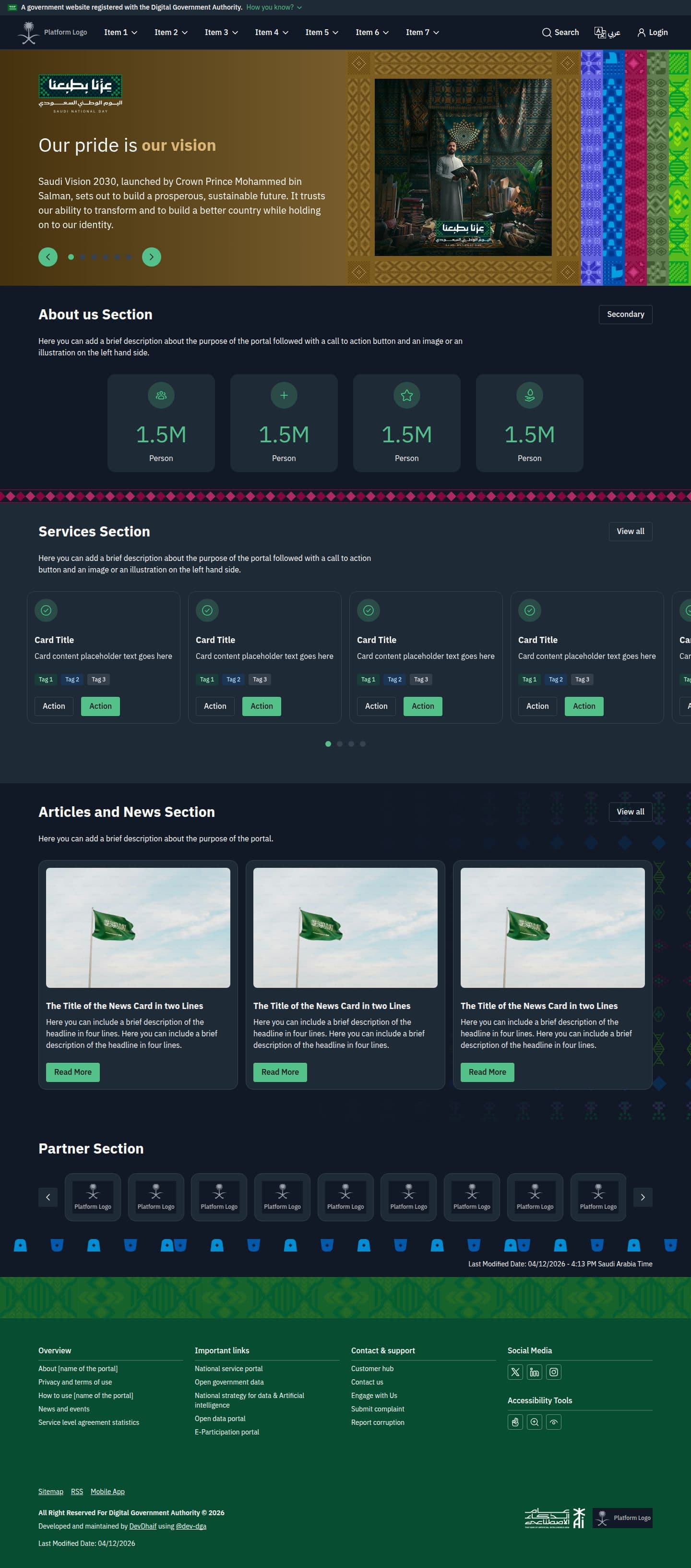

Saudi National Day template
The same page under the National Day brand layer, with a six-card hero deck that steps through the campaign themes, motif bands between sections, and a patterned footer.
- @dev-dga only
- Arabic and English
- Animated hero
- Reduced motion
The library
65 components, grouped for how you build.
From buttons and inputs to overlays, charts, and a full app shell - each with live examples and copy-paste code.
FAQ
DGA React components, answered.
What teams ask before adopting the library: what Platforms Code is, how to install it, and how far the Arabic, accessibility, and licensing guarantees go.
Is there a React component library for the Saudi DGA Platforms Code?
Yes. dev-dga is a free, MIT-licensed UI component library that implements the DGA Platforms Code in React 19. It ships 65 accessible components across three npm packages: @dev-dga/react, @dev-dga/css, and @dev-dga/tokens.
Browse all componentsWhat is the SDGA Platforms Code?
Platforms Code is Saudi Arabia’s national design system for government digital services, published by the Digital Government Authority. It defines the colors, typography, spacing, and interface components that government platforms share, so services from different agencies feel like one system.
See the coverage matrixHow is dev-dga different from platformscode-new-react?
platformscode-new-react is an npm package that wraps @platformscode/core, a Stencil web component library, through Stencil’s React output target, so each component is a custom element with a generated React shim around it. Its npm listing carries no README, homepage, or source repository, and we could not establish who publishes it. The Digital Government Authority’s own Platforms Code pages distribute a PDF specification and name no npm package or repository at all, so confirm the provenance of any package yourself before depending on it. dev-dga is a native React 19 implementation with no custom-element runtime, React’s own props and types, and support for React Server Components. It is independent and does not claim to be official either.
Compare against the specificationHow do I install the DGA React components?
Install the three packages with npm i @dev-dga/react @dev-dga/css @dev-dga/tokens, import the stylesheet once at your app root, and wrap your tree in DgaProvider. The provider carries text direction, dark mode, and the brand theme. Tailwind is optional and both majors are supported through a token bridge.
Read the setup guideDo these DGA UI components support Arabic and RTL?
Yes. Right-to-left is the default case, not a later patch. Every component mirrors through CSS logical properties, and the library ships Hijri and Umm al-Qura date pickers, abjad list counters, protected cursive letter-joining, and bidi-safe formatting for Saudi National IDs, IBANs, and +966 phone numbers.
See the Arabic and RTL demosAre the components accessible?
Every one of the 65 components targets WCAG 2.2 AA. Menus, dialogs, and tabs wrap Radix primitives for correct ARIA and focus management, keyboard semantics are verified in Playwright, and axe-core assertions fail the build on a regression. The conformance statement is self-assessed, not third-party audited.
Read the conformance statementIs dev-dga free to use commercially?
Yes. All three packages are MIT licensed and free to use in commercial and government projects, with no seat count, support contract, or attribution requirement.
Is this the official DGA component library?
No. dev-dga is an independent implementation and is not affiliated with, nor endorsed by, the Saudi Digital Government Authority. It follows the published Platforms Code specification and maps every component back to it, component by component, on the compliance page.
Check Platforms Code parityMIT · free to use · React 19